

Visualize it.
Love it.
Buy it.

Time Line
GV Design Sprint 5 Days
My Role
Solo UX/UI Designer - Springboard Bootcamp Project
Project Context
House2Home is an innovative website designed to simplify the process of finding decoration sets that perfectly matches your space while matching your budget. Your dream space starts here!
PROBLEM
Uncertainty leads to cart abandonment.
Decorating your home while staying within budget can be difficult and stressful. Many customers abandon their shopping experience simply because they feel unsure or overwhelmed by too many choices or a lack of visual clarity.
So, what if users had a tool to help them visualize and create their dream space?
SOLUTION
Turn your room into a vision board!
The solution is the “View in Your Room” feature, where users can upload a picture of their space and place the decor they intend to purchase, just like a decor game. This makes the experience fun and engaging, reducing uncertainty and increasing confidence in their selections.
-4.png)


Day 1: Understanding the Problem
Through user research and interviews, two key pain points emerged:
-
Users need decor that fits both their aesthetic and budget.
-
Users struggle to visualize how decor will look in their space, leading to purchase abandonment due to uncertainty and being overwhelmed.

-
Just graduated university
-
Live in a studio apartment
-
First time living alone
-
Excited to live in her own space
-
Wants a bright and lively environment
About Alley
Name: Alley Monroe
Age: 23 years old
Relationship: Single
Pain Points:
-
Knows the look she wants but doesn't know what to get
-
Inspiration decor in her Pinterest is too expensive and need something similar on budget
-
Not allowed to do big changes to the apartment since it is a rental
-
Sees cute items but doesn’t know if they will look good together
Goals:
-
Quick face lift
-
On budget
-
Fits the look she is going for
PERSONA
USER FLOWS
Task: Purchase decor for her tiny apartment that matches her vibes and budget.

Day 2: Getting Inspired
COMPETITOR ANALYSIS
To find solutions, I analyzed existing market approaches:
-
Amazon: Features like “View in 3D”, “Create style idea” and “View in Your Room” help users visualize products, though sizing accuracy is a drawback. (*These features seems to only exist in the app not in the website)
-
Anthropologie Living: No outstanding features to help users see if it matches their home. Offers high-end decor but lacks tools to preview items in a real space.
-
IKEA: Provides “As Seen on Instagram” to provide real-world style inspiration and “Get the Look” recommends products with a similar look that goes well with the product users are browsing.
-
Nestset.com: Allows shopping by style and color and has a complementary virtual styling session with a interior designers however that comes with a high price tag and user can't easily preview or get inspirations by themselves.
From these insights, I focused on solving the core issue: allowing users to easily check if decor matches their space before purchasing while being able to choose their budget.


CRAZY 8
If they have an easy way to verify if the decor will match their space beforehand, they will be more likely to complete the purchase.
Users often struggle with the uncertainty of whether a decor item will actually look good in their home. This hesitation stems from not being able to visualize the product in their unique space, leading to doubt about size, style, and color compatibility. As a result, many users feel overwhelmed and anxious about making the wrong choice, ultimately causing them to abandon their shopping journey before completing a purchase.
So, I decided to begin ideating with a Crazy 8 sketching session, focusing on features that would reduce this uncertainty and make the shopping experience more confident and enjoyable. My goal was to explore quick, diverse ideas around visualization tools


Day 3: Storyboarding the Solution
After the Crazy 8 I selected the most promising ideas. On the third day, I created a solution sketch focused on helping users visualize how the decor would complement their environment. The sketch was designed with simplicity and engagement in mind to ensure a user-friendly experience that reduces stress and supports confident decision-making.


Screen 1: Homepage: Where users begin browsing.
Screen 2: Style Selection Page: Allows users to choose their preferred aesthetic and budget (with a skip option).
Screen 3: Product Lineup Page: Displays decor options and allows users to refine selections via keywords and filter.
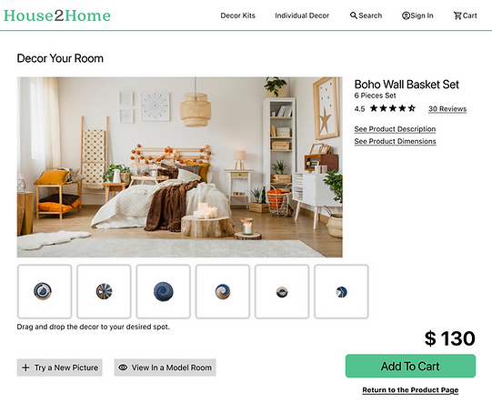
Screen 4: Individual Product Page (Critical Screen): Features "View in Your Room" and "View in a Model Room" enabling users to upload their space or use a model room for preview.
Screen 5: Instructions Screen: Provides best practices for uploading room images to optimize the experience.
Screen 6: Interactive Preview Screen: Users can move decor pieces within their space, similar to home decoration games, enhancing engagement and confidence.
Screen 7: Add to Cart: Users add the decor to the cart and a confirmation pops up on the top of the screen.
Screen 8: Checkout: Mimics a standard e-commerce flow for seamless purchasing.
Day 4: Prototyping and Goals for Testing
FINAL SCREENS
With prototyping, I prioritized simplicity and familiarity, allowing users to effortlessly browse a wide selection of decoration options while selecting their budget. I also ensured that users could easily navigate and use the "View in Your Room" feature, helping them visualize how the decor will look in their space and reducing the chances of abandoning the purchase due to uncertainty.


GOALS FOR USER TESTING
After Prototyping I prepared for the final the Usability Testing which was conducted on the final day. To ensure success goals were set and a script was created as long as preparing th e tools for recording the test.
The main test goals were:
-
Validate if users can use the “View in Your Room” feature without issues.
-
Determine if the shopping experience is enjoyable and reduces purchase abandonment.
-
Gather feedback on whether the prototype effectively solves the core problem.
Day 5: Usability Testing & Learnings
USABILITY TEST
I conducted usability testing with five participants, using their insights to inform a more streamlined and user-friendly design.
The design sprint successfully uncovered and addressed key frustrations users face when shopping for home décor online. All participants were able to easily set their budget and use the "View in Your Room" feature. Feedback was overwhelmingly positive—users appreciated being able to visualize products in their own space, which helped reduce uncertainty and boosted confidence in their selections. In addition to visualization, the interactive preview feature added a playful, game-like layer to the experience, increasing user engagement. Minor refinements were made to the checkout process based on feedback, which further improved overall usability.
"It's really good, because people like my husband—he can’t see images in his head, like some people do. So when I show him products online, he can’t picture how they’ll come together until everything arrives. This would be great for people like him. He could just take a picture and see exactly how it looks."
- User Testing Participant No 3
REFLECTION
Good UX isn’t just about solving functional problems. It’s also about reducing emotional friction.
Working on the House2Home project was a valuable and eye-opening experience. It highlighted how much emotional weight and uncertainty users carry when trying to make aesthetic decisions online, especially in something as personal as home decor. Through user interviews, Crazy 8 sketching, and usability testing, I learned that empowering users with visual confidence can significantly reduce anxiety and lead to stronger engagement.
One of my biggest takeaways was the importance of bridging the gap between inspiration and action. Users are not just looking for aesthetically pleasing products, they need to see how those products will fit into their own lives before they feel comfortable committing. By designing and testing the “View in Your Room” feature, I saw firsthand how even a simple visual tool can shift a user’s mindset from hesitant to decisive. This project reinforced that good UX isn’t just about solving functional problems. It’s also about reducing emotional friction. When we design with empathy and intention, we can turn a stressful process into a joyful, even playful, experience.