


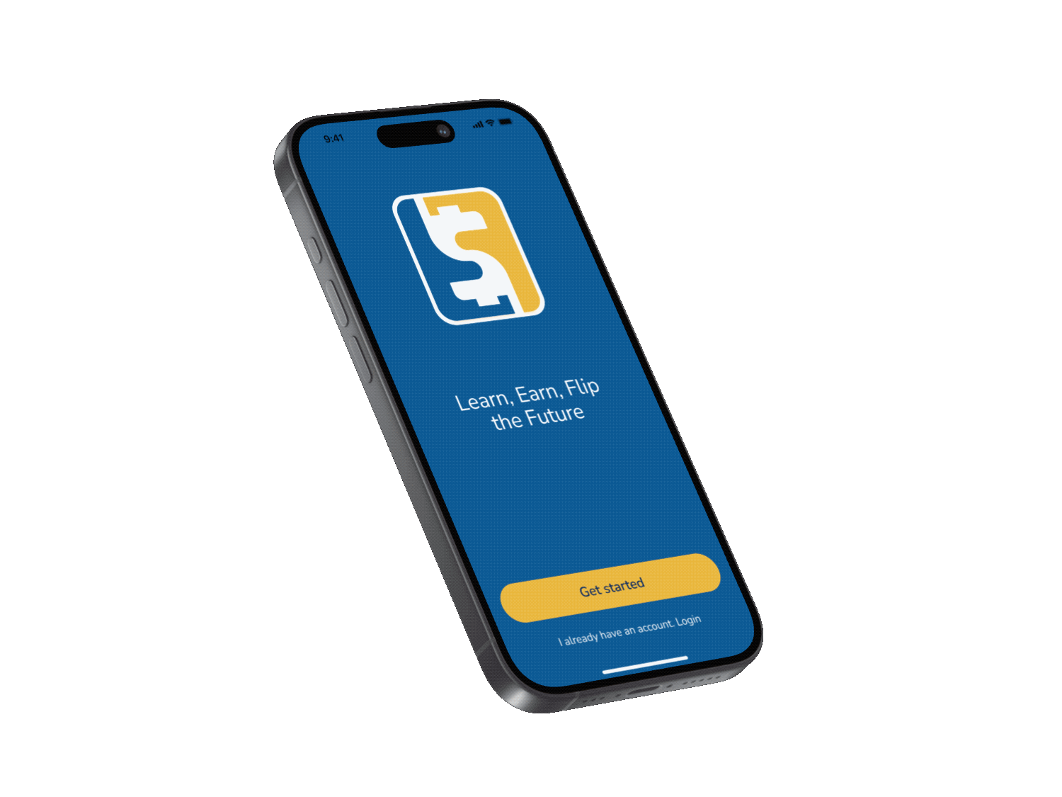
Empowering young minds, one flip at a time.
Time Line
March 19, 2025 - April 21, 2025
My Role
Illustration, Research and Ux design
Project Context
This project was part of an internship, where we worked as a team of three closely with the CEO and team at Flip & Floss. Over the course of four weeks, we collaborated directly with the client to understand the company’s goals and vision, conduct user research, and design a kid-friendly financial literacy app. Our team was responsible for delivering complete UX/UI solutions, including research, ideation, wireframing, illustration, prototyping, user testing, and final screens.
CONCEPT
A Revolutionary Money App for Families
Flip & Floss is a company dedicated to teaching children financial literacy through engaging, gamified experiences that prepare them for the real world. The CEO’s vision is to empower all children, regardless of their financial background so they can gain the knowledge and confidence to shape their own financial futures. The platform blends virtual currency and real money with interactive courses, challenges, dashboards, and AI-driven personalization to make money management both fun and educational. It’s designed for both kids and supervising adults, offering children an enjoyable, independent learning journey while allowing parents to stay involved and ensure a safe, supportive environment.
DELIVERABLES
Our team was assigned to design the following features for the children’s portal:
1. Gamified Onboarding Quest
Design an interactive onboarding flow that introduces key features through fun, quest-like activities.
2. First Flip Dollar Experience
Implement an instant reward system to positively reinforce early engagement and behavior.
3. Flip AI Personalization
Use onboarding data and user behavior to customize content, challenges, and financial tips.
4. Avatar Customization
Let kids create and personalize avatars that evolve with their progress.
5. User Dashboard Design
Create a dashboard that provides a snapshot of the user’s progress in savings, easy access to Flip AI, and ongoing challenges.
PROBLEM
One of the biggest challenges was balancing fun with learning.
Children often lose interest quickly when introduced to educational content. The challenge is to design an onboarding experience that immediately captures their attention with a strong "wow factor," sparks excitement about financial literacy, and motivates them to continue engaging with the app over time.
SOLUTION
Learn, Earn, and Grow — One Flip at a Time!
Design a gamified onboarding journey that feels like an interactive quest, with digestible visuals, personalized avatars, and immediate rewards to hook children from the start. The key is to present financial concepts in bite-sized, digestible pieces that match kids’ attention spans and learning styles. By combining storytelling, playful UI elements, and AI-driven personalization, the experience will build excitement around financial literacy while encouraging consistent, long-term engagement with the app.


INTERACTIVE QUEST
The process is designed to be interactive and engaging by having kids answer questions about their interests to receive AI-driven personalized advice, earn Flip Dollars early in their journey to stay motivated, and have fun building their avatar which they can further customize by collecting items with the Flip Dollars they earn.

DIGESTIBLE VISUAL
For the visuals, we prioritized simplicity to balance the app’s information-dense content, using fun and friendly illustrations to make concepts easier to understand.
For example, Flip is the in-app advisor who helps guide kids through their financial journey. Flip is a squirrel because squirrels are natural planners and savers, making them the perfect symbol for teaching financial responsibility.

BITE SIZE ONBOARDING
Early in the research process, we realized that the best approach was to avoid overwhelming users with too much information, especially children. The key is to present financial concepts in bite-sized pieces that match kids’ attention spans, helping them stay focused and understand instructions more easily.
We decided to use a continuous onboarding approach. As children are introduced to new features, they can complete them through daily challenges and earn Flip Dollars.
DESIGN PROCESS

Research & Ideation
Mid-fidelity Wireframe & Prototype
High-fidelity Prototype & Usability Testing
Final Iteration & Presentation
-
Competitive analysis
-
User persona refinement
-
User journey mapping
-
Red route definition
-
Information architecture
-
Low-fidelity sketching
-
Mid-fidelity wireframes & prototype
-
Illustration drafts
-
UI Component library
-
First usability testing
-
Micro-interaction & interactive prototype
-
Feedback synthesis
-
High-fidelity prototyping
-
Illustration
-
Second usability testing
-
Iterative refinements to high-fidelity prototype
-
Usability testing reports
-
Final polish of all screens
-
Organized Figma files
-
Next Steps
-
UX/UI presentation for CEO & team
-
Incorporate feedback
-
Handoff of files & permissions
As soon as our team was matched, we held a kick-off meeting to get to know each other, understand our strengths, and share what we enjoy most as UX/UI designers. This helped us build strong collaboration and play to each other’s skills throughout the project. The next step was meeting with the client to better understand their needs and expectations. After that, we created a detailed project plan, divided responsibilities, and set up a shared meeting schedule to stay organized and work efficiently within the four-week deadline.
COMPETITIVE ANALYSIS
Financial learning X illustration and UI elements
Early on, we recognized that the key to success was finding the right balance between educational content, financial tools, and a gamified experience with fun, engaging visuals. To guide our design decisions, we conducted a competitive analysis based on two main criteria: fintech safety features and visual design. During my research, I noticed that while many language-learning and habit-tracking apps have successfully implemented gamification, several fintech apps aimed at children lacked engaging design and interactive experiences. This insight helped highlight a clear opportunity to improve both the visual appeal and usability of financial tools for kids.

Greenlight Kid
BusyKid
FamZoo
GoHenry
Acorns Early

Prodigy Math Game
Habitica
Duolingo
REDEFINED PERSONAS
We redefined the personas and their user journeys by interviewing five teens who closely matched our target audience. These conversations helped us better understand their goals, challenges, and behaviors. Using these insights, we updated the existing personas to more accurately reflect real users of the app. The refined personas guided our design decisions and ensured a more personalized, user-centered experience throughout the project.


INFORMATION ARCHITECTURE
When it comes to financial apps, organizing and grouping content effectively can make or break the user experience.
To create a seamless and intuitive experience for children, I focused on organizing content in a way that supports clear navigation, progressive learning, and user independence. Since financial topics can be information-heavy, our goal was to group the content accessible and easy to digest without overwhelming young users.


LOW-FIDELITY SKETCHING
Designing with Kids in Mind!
To kick off the design process, we used low-fidelity sketching as a fast and flexible way to explore layout ideas, user flows, and feature placement. These hand-drawn sketches helped us visualize key screens and interactions without getting distracted by visual details. Each team member contributed sketches, which we then reviewed together to combine the strongest elements into a unified direction. Throughout this process, we kept children's behavior and attention spans in mind, aiming to create layouts that felt intuitive, simple, and engaging for young users. This collaborative step allowed us to quickly iterate, align on structure, and make thoughtful decisions before moving into digital wireframes.


DESIGN PROCESS
Our design process was highly collaborative and iterative. We began with low-fidelity sketches to explore layout ideas and quickly test different approaches. As we gathered feedback from teammates, mentors, and user testing, we continuously refined our designs. Each round of iteration helped us better align the user experience with children’s behavior and learning needs. We focused on making the interface intuitive, engaging, and age-appropriate while balancing educational content with fun, gamified elements.
FLIP DOLLARS
☹︎ Pain Point
Previous client research showed that kids struggled to understand the concept of Flip Dollars.
Introduced Flip Dollars early and used distinct colors to clearly separate them from real money.
☺︎ Solution
To address this, we introduced Flip Dollars early in the onboarding process, when kids are most focused. As soon as the user finishes the login, they earn their first Flip Dollars. This not only solves the issue, but the early reward also motivates kids to start their financial journey. After high-fidelity testing, 100% of users understood what Flip Dollars are.
We also used colors to clearly differentiate Flip Dollars from real money. Flip Dollars are yellow, while real money is green, which helps avoid confusion and builds understanding from the start.

MEET FLIP AI
☹︎ Pain Point
Most kids are not interested in finance, which can make it challenging to engage them with
traditional financial education.
Capturing their attention by helping them achieve their personal goals and wants through AI-powered, personalized advice.
☺︎ Solution

To address the challenge that most kids are not naturally interested in finance, we focused on capturing their attention by helping them visualize that their goals are achievable through hard work and financial knowledge.
We introduced Flip the squirrel, their friendly in-app advisor, who asks questions about their goals and interests to provide personalized, AI-powered advice tailored to each child’s journey.
DASHBOARD
☹︎ Pain Point
Financial app dashboards can be overwhelming, and some features also require parental permission to access.
Separated information into manageable blocks, and added a feature that allows kids to send approval requests to their guardian.
☺︎ Solution
To solve this, we separated information into clear, manageable blocks to avoid overwhelming users and help kids easily identify their financial progress.
We also added a feature that lets kids send approval requests directly to their guardian through in-app notifications. Since adults can get busy and life often gets in the way, this empowers kids to take initiative and helps ensure that important approvals don’t get forgotten.

ONBOARDING
☹︎ Pain Point
Kids have a short attention span.
Implementing continuous onboarding with visual guidance and short, catchy sentences to match kids’ attention spans.
☺︎ Solution

Because kids have shorter attention spans and can quickly lose interest when faced with too much information at once, we implemented a continuous onboarding strategy that introduces features gradually through engaging visuals and short, catchy sentences.
This approach not only keeps them focused and motivated, but also ensures they absorb key financial concepts in a way that feels natural, fun, and manageable.
ITERATIONS
Before

After

AI customization - We introduced an “Other” option to give kids the freedom to choose what truly fits them, rather than forcing them to select something that doesn’t feel right. This app is about empowerment, helping kids express themselves authentically and shape their own future with confidence.
Before

After

Avatar Flow - We simplified the avatar customization flow by replacing ambiguous icons with clear text prompts. During user testing, we discovered confusion around the icons, which created friction in the process. After iterating on the design, all 5 users in the final round of testing completed the flow smoothly.
Before

After

Menu Bar - We increased the contrast on locked features to improve visibility and reduce confusion. During earlier testing rounds, users often overlooked these elements or didn’t realize they were locked. By making them more visually distinct, we helped users better understand which features were currently unavailable.
ILLUSTRATION
I designed the illustrations to be inclusive of age and disabilities. The avatar is gender-neutral, allowing kids to build their character freely without being limited by labels. The base set is simple and intuitive, making it easy for children to customize, and flexible enough to support endless possibilities for future personalization.

REFLECTIONS
This project was an incredible learning opportunity, both in terms of design and teamwork. Working closely with two other designers and the Flip and Floss CEO over the course of four weeks taught me the importance of clear communication, mutual respect, and shared responsibility. Each team member brought unique strengths, and by aligning on our goals early and checking in consistently, we were able to stay organized and support one another through every phase, from research to final delivery.
One important lesson came when we realized that some of our original screens might not fully comply with recent updates to the Children’s Online Privacy Protection Act (COPPA). We quickly created updated alternatives, informed the client, and recommended that they consult their legal team before moving forward. Since Flip and Floss is a Canadian company and follows different regulations, this opened up an important discussion about designing responsibly based on location-specific rules.
This experience also helped me grow in how I communicate, give and receive feedback, and remain flexible as ideas evolve. We did not always agree at first, but by listening and making decisions together, we were able to create a more thoughtful and user-focused solution. Most importantly, I learned the value of collaboration and how much can be achieved when a team works with trust and shared purpose.